Help310:Menus Menu Item Tags Items List All
From Joomla! Documentation
Description
Used to create a 'List of all tags' page per tag(s) selected.
How to Access
Add a new menu item 'List All Tags'
- Select Menus → [name of the menu] → Add New Menu Item from the dropdown menu of the Administrator Panel
- Select Tags → List All Tags in the modal popup window.
Edit an existing menu item 'List All Tags'
- Click on the menu item's Title in Menu items.
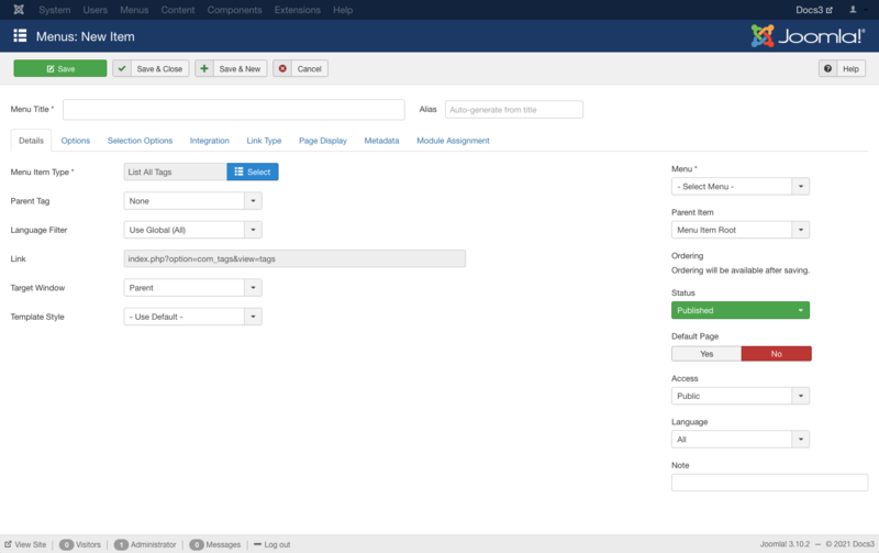
Screenshot
Form Fields
- Menu Title. The title that will display for this menu item.
- Alias. The internal name of the menu item. Normally, you can leave this blank and Joomla will fill in a default value. The default value is the Title or Name in lower case and with dashes instead of spaces. You may enter the Alias manually. Learn more about Aliases.
Details
- Menu Item Type. The Menu Item Type selected when this menu item was created. This can be one of the core menu item types or a menu item type provided by an installed extension.
- Parent Tag. (None/Root/...) If set only tags that are direct children of the selected tag will be displayed.
- Language Filter. (Use Global/All/Current/...) Optionally filter the list of tags based on language.
- Link. The system-generated link for this menu item. This field cannot be changed and is for information only.
- Target Window. This determines how the new page will be opened. Options are:
- Parent: Open new menu item in parent window. This is the default.
- New Window With Navigation: Open menu item in a new window with full browser navigation (for example, "back" button).
- New Without Navigation: Open menu item in a new window without browser navigation.
- Template Style. Controls the template style for this menu item. A list box will show the available template styles for your site.
- - Use Default -: Use the default style for the site to show this menu item.
- [template style]: Select a specific template style to always show this menu item with that style.
- Menu. Shows which menu the menu item will appear in.
- Parent Item. The parent menu item for this menu item. Used to determine whether a Menu Item is a top-level item or a submenu item.
- Menu Item Root: Select the default value if this is a top-level Menu Item.
- [menu item title]: Select the Menu Item that is this menu item's parent.
- Ordering. Indicates the order of this Menu Item in the Menu. The default Order is to add the Menu Item to the end of the Menu. This Menu Item will moved to the order position just after the Menu Item selected from the dropdown list. Note: The Order can also be changed in Menu Items.
- Status. (Publish/Unpublish/Trash) The published status of the menu item.
- Default Page. (Yes/No) If Yes, this menu item is the default or home page for the site. There must be exactly one menu item set as the default page. You can change the default page in 2 ways:
- Click on the Home column of the desired menu item in Menu Items.
- Open the menu item for the new default page and change the Default Page setting to Yes.
- Access. Who has access to this menu item.
- Public: Everyone has access.
- Guest: Everyone has access.
- Registered: Only registered users have access.
- Special: Only users with author status or higher have access.
- Super Users: Only super users have access.
- Language. Select the language for this menu item. If you are not using the multi-language feature of Joomla, keep the default of 'All'.
- Note. Menu item note. This is normally for the site administrator's use (for example, to document information about this menu item) and does not show in the Frontend of the site.
Options
- Number of Columns: The number of columns to arrange the tags in. Note that this may not be the number displayed if 12 does not divide evenly into it because display is based on a 12 column grid.
- Heading Description. Description to display at the heading of tags list.
- Show Heading Image. (Use Global/Hide/Show) Show an image at the heading of the tags list.
- Heading Image File. Select or upload the image to display in the heading of the tags list.
- Order. (Use Global/Title/Hits/Created Date/Modified Date/Published Date) Order tags will be displayed in.
- Direction. (Use Global/Descending/Ascending) Sort order. Descending is highest to lowest. Ascending is lowest to highest.
- Item Images. (Use Global/Hide/Show) Shows the first image for each item in the list.
- Tag Descriptions. (Use Global/Hide/Show) Show or Hide the description for each tag listed.
- Maximum Characters. The maximum number of characters to display from the description in each tag.
- Hits. The number of times an item has been viewed.
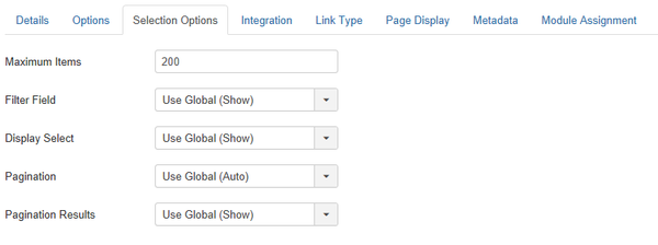
Selection Options
- Maximum Items. The maximum number of results to return.
- Filter Field. (Use Global/Hide/Show) Show or Hide a filter field for the list.
- Display Select. (Use Global/Hide/Show) Whether to hide or show the Display # control that allows the user to select the number of items to show in the list.
- Pagination. Show or hide Pagination support. Pagination provides page links at the bottom of the page that allow the User to navigate to additional pages. These are needed if the listed tags will not fit on one page.
- Use Global: Use the default value from the tags options screen.
- Auto: Pagination links shown if needed.
- Show: Pagination links shown if needed.
- Hide: Pagination links not shown. Note: In this case, Users will not be able to navigate to additional pages.
- Pagination Results. (Use Global/Hide/Show) Show or Hide the current page number and total pages (e.g., "Page 1 of 2") at the bottom of each page. Use Global will use the default value from the Tags options.
Integration
- Show Feed Link. (Use Global/Hide/Show) Show or hide an RSS Feed Link. A Feed Link will show up as a feed icon in the address bar of most browsers.
Link Type
- Link Title Attribute. An optional, custom description for the title attribute of the menu hyperlink.
- Link Class. An optional class to apply to the menu hyperlink.
- Link Image. Select an image to use with 'Menu Title'. Use 'Add Menu Title' set to 'No' to show just image.
- Image Class. The class which is added to the image (src tag).
- Add Menu Title. (Yes/No) If optional image is selected, shows a 'Menu Title' next to image.
- Display in Menu. (Yes/No) Select 'No' if you want to exclude this menu item from displaying in the menu. Note: Any submenu items will also be hidden.
Page Display
- Browser Page Title. Optional text for the "Browser page title" element. If blank, a default value is used based on the Menu Item Title.
- Show Page Heading. (Use Global/Yes/No). Show or hide the Browser Page Title in the heading of the page (If no optional text entered - will default to value based on the Menu Item Title). The Page heading is usually displayed inside the H1 tag.
- Page Heading. Optional alternative text for the Page heading.
- Page Class. Optional CSS class to add to elements in this page. This allows CSS styling specific to this page.
Metadata
- Meta Description. An optional paragraph to be used as the description of the page in the HTML output. This will generally display in the results of search engines. If entered, this creates an HTML meta element with a name attribute of "description" and a content attribute equal to the entered text.
- Meta Keywords. Optional entry for keywords. Must be entered separated by commas (for example, "cats, dogs, pets") and may be entered in upper or lower case. (For example, "CATS" will match "cats" or "Cats"). Learn more about Meta Keywords.
- Robots. The instructions for web "robots" that browse to this page.
- Use Global: Use the value set in Global Configuration → Site → Metadata Settings.
- index, follow: Index this page and follow the links on this page.
- noindex, follow: Do not index this page, but still follow the links on the page. For example, you might do this for a site map page where you want the links to be indexed but you don't want this page to show in search engines.
- index, nofollow: Index this page, but do not follow any links on the page. For example, you might want to do this for an events calendar, where you want the page to show in search engines but you do not want to index each event.
- noindex, nofollow: Do not index this page or follow any links on the page.
- Secure. Whether or not to use SSL and the Secure Site URL for this page.
- Off: Do not use SSL.
- On: Use SSL.
- Ignore: Ignore this setting and use the global setting for the site.
Module Assignment
- Unassigned Modules. (Show/Hide) Show or hide modules unassigned to this menu item.
- Unpublished Modules. (Show/Hide) Show or hide modules that are unpublished.
Toolbar
At the top left you will see the toolbar.
The functions are:
- Save. Saves the menu item and stays in the current screen.
- Save & Close. Saves the menu item and closes the current screen.
- Save & New. Saves the menu item and keeps the editing screen open and ready to create another menu item.
- Save as Copy. Saves your changes to a copy of the current menu item. Does not affect the current menu item.Note: This toolbar icon is only shown if you edit an existing menu item.
- Close. Closes the current screen and returns to the previous screen without saving any modifications you may have made.
- Help. Opens this help screen.
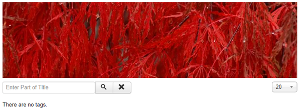
Frontend Screenshot
Example Frontend Site images are generic images using Joomla core installation supplied free Frontend Templates. The actual view can depend on the installed custom template used and the template's style for those views on a Joomla website. Tags List Layout:
Related Information
| Related Help Screens | Description |
|---|---|
| Menus Menu Item Tags Items Compact List | Used to create a 'Compact List of Tagged Items' page per tag(s) selected. |
| Menus Menu Item Tags Items List | Used to create a 'Tagged List of Items' page per tag(s) selected. |


