Help4.x:Menu Item: List All Contact Categories
From Joomla! Documentation
Description
The List All Contact Categories menu item type is used to show a list of contact categories within a category.
How To Access
To create a new List All Contact Categories menu item:
- Select Menus → [name of the menu] from the Administrator menu (for example, Menus → Main Menu).
- Select the New Toolbar button.
- Select the Menu Item Type Select button
 . Then...
- In the modal dialog select the Contacts item to open a list and then select the List All Contact Categories item.
To edit an existing List All Contact Categories Menu Item:
- Select its Title in the Menus: Items list.
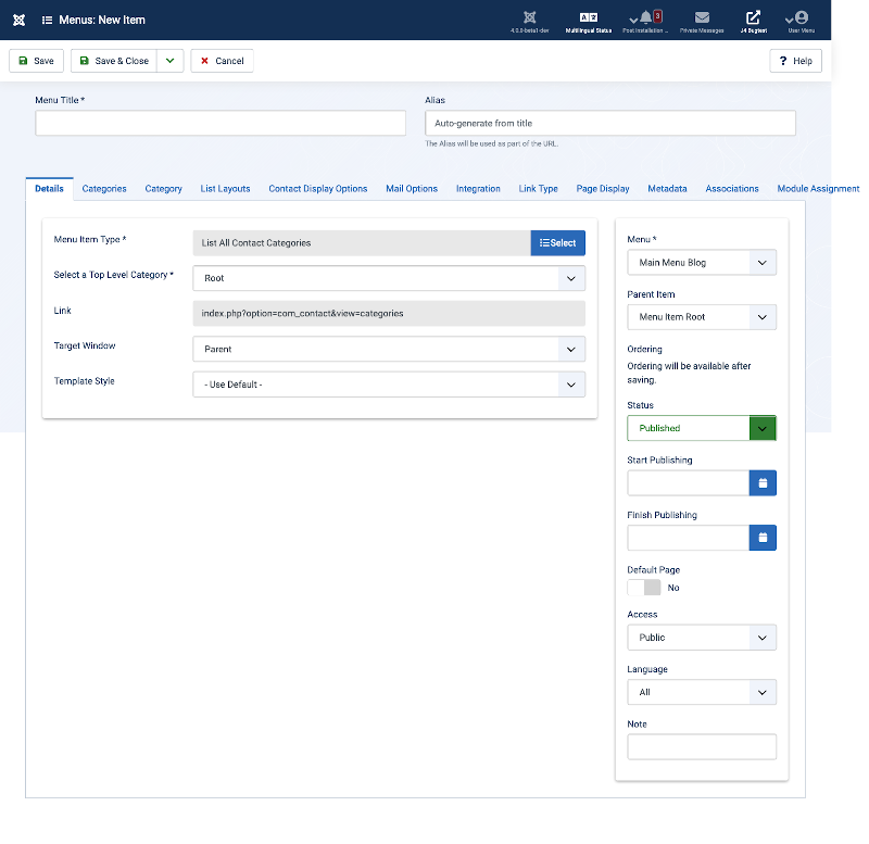
Screenshot
Form Fields
- Menu Title: The title that will display for this menu item.
- Alias. The internal name of the item. Normally, you can leave this blank and Joomla will fill in a default value Title in lower case and with dashes instead of spaces. Learn more.
Details Tab
Left Panel
- Menu Item Type. The Menu Item Type selected when this menu item was created. This can be one of the core menu item types or a menu item type provided by an installed extension.
- Top Level Category. Categories that are within this category will be displayed.
- Link. The system-generated link for this menu item. This field cannot be changed and is for information only.
- Target Window. This determines how the new page will be opened. Options are:
- Parent: Open new menu item in parent window. This is the default.
- New Window With Navigation: Open menu item in a new window with full browser navigation (for example, "back" button).
- New Without Navigation: Open menu item in a new window without browser navigation.
- Template Style. Controls the template style for this menu item. A list box will show the available template styles for your site, similar to the following:

- Select "Use Default" to use the default style for the site. Select a specific template style to always show this menu item with that style.
Right Panel
- Menu. Shows which menu the link will appear in.
- Parent Item. The parent menu item for this menu item. Used to determine whether a Menu Item is a top-level item or a submenu item. Select 'Menu Item Root' (the default value) if this is a top-level Menu Item. Otherwise, select the Menu Item that is this item's parent.
- Ordering. You can change the order of an item within a list as follows:
- If the list Filter Options include a Position filter select the desired Position. This will limit the list to items that are assigned to that Position.
- Select the Ordering icon
 in the Table heading to make it the active ordering item. The ordering icons in each row will change from light grey to dark grey and the pointer will change to a drag arrow on hover.
 - Select one of the Ordering icons
 and drag it up or down to change the position of that row in the list. The items will display in the new order within the Position.
- Status. The published status of the item.
- Start Publishing. Date and time to start publishing. Use this field if you want to enter content ahead of time and then have it published automatically at a future time.
- Finish Publishing. Date and time to finish publishing. Use this field if you want to have content automatically changed to Unpublished state at a future time (for example, when it is no longer applicable).
- Default Page. If Yes, this menu item is the default or home page for the site. There must be exactly one menu item set as the default page. You can change the default page in two ways:
- Click on the Home column of the desired menu item in the Menus: Items screen.
- Open the menu item for the new default page and change the Default Page setting to Yes.
- Access. The viewing Access Level for this item.
- Language. Item language.
- Note. This is normally for the site administrator's use (for example, to document information about this item) and does not show in the Frontend of the site.
Categories Tab
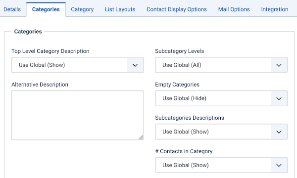
The Categories Options control the way categories information is displayed in the layout. Things that you can modify are:
- Top Level Category Description. (Use Global/Hide/Show) Show description of the top level category or optionally override with the text from the description field found in menu item. If using Root as top level category, the description field has to be filled.
- Alternative Description. If you enter some text in this field, it will override the Top Level Category Description, if it has one.
- Subcategory Levels. The number of subcategory levels to display.
- Use Global Use the default value from the contacts options screen.
- All All subcategories under parent category.
- <#> Select a number, 1 to 5 to set depth of subcategories.
- Empty Categories. (Use Global/Hide/Show) If Show, empty categories will display. A category is only empty - if it has no Contacts or subcategories.
- Subcategories Descriptions. (Use Global/Hide/Show) Show or hide the subcategories description.
- # Contacts in Category. (Use Global/Hide/Show) Show or hide number of contacts in a category.
Category Tab
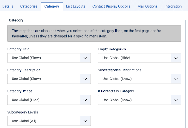
The Category Options control the way that category information is shown in the layout. The Category List Layout has the following Category Options, as shown below.
- Category Title. (Use Global/Hide/Show) If Show, the Category Title will show as a subheading on the page. The subheading is usually displayed inside the "H2" tag.
- Category Description. (Use Global/Hide/Show) Show or hide the description of the selected Category.
- Category Image. (Use Global/Hide/Show) Whether to hide or show the category image.
- Subcategory Levels. (Use Global/All/1-5) The number of levels of subcategories to show in the layout. Select All to show all levels in the subcategory hierarchy.
- Empty Categories. (Use Global/Hide/Show) Whether to hide or show the categories that contain no content items or subcategories.
- Subcategories Descriptions. (Use Global/Hide/Show) Whether to hide or show the category description of subcategories.
- # Contacts in Category. (Use Global/Hide/Show) Whether to hide or show the number of Contact in a Contact Category.
List Layouts Tab
List Layout Options control the appearance of the list layout.
- Filter Field: (Use Global/Hide/Show) Whether to show a Filter field for the list. Select Hide to hide the filer field
- Display Select. (Use Global/Hide/Show) Whether to hide or show the Display # control that allows the user to select the number of items to show in the list. An example of how it is shown in the Front End (website) view below.

- If there are more items than this number, you can use the page navigation buttons (Start, Prev, Next, End, and page numbers) to navigate between pages. Note that if you have a large number of items, it may be helpful to use the Filter options, located above the column headings, to limit which items display.
- Table Headings. (Use Global/Hide/Show) Table Headings show a heading above a list, like generic heading image shown below.

- If set to Show, this heading will show above the list. If set to Hide, the list will show with no headings.
- Position. The Contact's current position.
- Email. Set to control the Email's display in list.
- The following options are available.
- Use Global: Use the default value from the contacts options screen.
- Show: Show in list.
- Hide: Do not show in list.
- Phone. Set to control the Phone's display in list.
- The following options are available.
- Use Global: Use the default value from the contacts options screen.
- Show: Show in list.
- Hide: Do not show in list.
- Mobile. Set to control the Mobile's display in list.
- The following options are available.
- Use Global: Use the default value from the contacts options screen.
- Show: Show in list.
- Hide: Do not show in list.
- Fax. Set to control the Fax's display in list.
- The following options are available.
- Use Global: Use the default value from the contacts options screen.
- Show: Show in list.
- Hide: Do not show in list.
- City or Suburb. Set to control the City or Suburb's display in list.
- The following options are available.
- Use Global: Use the default value from the contacts options screen.
- Show: Show in list.
- Hide: Do not show in list.
- State or County. Set to control the State or County's display in list.
- The following options are available.
- Use Global: Use the default value from the contacts options screen.
- Show: Show in list.
- Hide: Do not show in list.
- Country. Set to control the Country's display in list.
- The following options are available.
- Use Global: Use the default value from the contacts options screen.
- Show: Show in list.
- Hide: Do not show in list.
- Pagination. Hide or Show Pagination support. Pagination provides page links at the bottom of the page that allow the User to navigate to additional pages. These are needed if the listed items will not fit on one page. An example is shown below.
-
- Use Global: Use the default value from the component options screen.
- Auto: Pagination links shown if needed.
- Show: Pagination links shown if needed.
- Hide: Pagination links not shown. Note: In this case, Users will not be able to navigate to additional pages.
- Pagination Results. Hide or Show the current page number and total pages (e.g., "Page 1 of 2") at the bottom of each page. Use Global will use the default value from the component options.
Contact Display Options Tab
Contact Display Options control the appearance of the list layout.
- Display Format. Determines the style used to display sections of the contact form.
- The following options are available.
- Use Global: Use the default value from the contacts options screen.
- Sliders: Slider contact view.
- Tabs: Tabbed contact view.
- Plain: Plain text contact view.
- Contact Category. Set to control the Contacts Category display view.
- The following options are available.
- Use Global: Use the default value from the contacts options screen.
- Hide: Do not show the Category name of the contacts.
- Show Without Link: Show Category name of contacts as heading styled text only.
- Show With Link Show Category name of contacts as heading styled text linked to Category.
- Show Contacts List. Allow the user to use a drop down list of all contacts in one contact category. Set one of the following options:
- Use Global: Use the default value from the contacts options screen.
- Show: Show to allow users to select a contact in a drop down list.
- Hide: Do not display the Contact list.
Common Contact Display Fields are:
- Tags. Display the contact's Tags.
- Name. Display the contact's Name.
- Contact's Position. Display the contact's Contact's Position.
- Email. Display the contact's Email.
- Street Address. Display the contact's Street Address.
- City or Suburb. Display the contact's City or Suburb.
- State or County. Display the contact's State or County.
- Postal Code. Display the contact's Postal Code.
- Country. Display the contact's Country.
- Telephone. Display the contact's Telephone.
- Mobile phone. Display the contact's Mobile phone.
- Fax. Display the contact's Fax.
- Webpage. Display the contact's Webpage.
- Misc. Information. Display the contact's Misc. Information.
- Image. Display the contact's Image.
- vCard. Display the contact's vCard.
- Show User Articles. Display the contact's Articles.
- # Articles to List. Display the contact's Number Articles to list.
- Show Links. Display the contact's additional links. These could be links to Social Media accounts, such as Twitter, Facebook, Skype...
- All of the Common Contact Display Fields have the following options available:
- Use Global: Use the default value from the contacts options screen.
- Show: Show this field.
- Hide: Do not display this field.
- Link <letter> Label. <A to E> Labels (5) to override shown link's label.
Mail Options Tab
Contact Mail Options control the appearance of a Contact's → Contact Form if it is enabled.
- Show Contact Form. Display the contact's contact form.
- Send Copy to Submitter. (Use Global/Hide/Show) Display the a check box to allow a Submitter to send a copy of email to themselves.
- Session Check. (Use Global/Yes/No) Check for the existence of session cookie. Users without cookies enabled will not be able to send emails.
- Custom Reply. (Use Global/Yes/No) Turn on or off the custom message reply to contact form's submitter.
- Contact Redirect. Enter alternative URL to redirect submitter after a successful contact form email was sent.
Integration Tab
The Featured Articles layout has the following Integration Options.
These determine whether a news feed will be available for the page and what information it will show.
- Show Feed Link. (Use Global/Hide/Show) Whether to Hide or Show a link to a news feed (RSS Feed). If set to Show, a Feed Link will show up as a feed icon in the address bar of most modern browsers.
Common Options
See Menus: Edit/New Item for help on fields common to all Menu Item types located in the following Tabs:
- Link Type
- Page Display
- Metadata
- Associations
- Module Assignment
Toolbar
At the top of the page you will see the toolbar shown in the Screenshot above. The functions are:
- Save. Saves the item and stays in the current screen.
- Save & Close. Saves the item and closes the current screen.
- Save & New. Saves the item and keeps the editing screen open and ready to create another item.
- Save & Close. Saves the item and closes the current screen.
- Cancel. Closes the current screen and returns to the previous screen without saving any modifications you may have made.Or
- Close. Closes the current screen and returns to the previous screen without saving any modifications you may have made. This toolbar icon is not shown if you are creating a new item.
- Help. Opens this help screen.
Related Information
| Related Help Screens | Description |
|---|---|
| Contacts: Options | Contact Options configuration allows setting of parameters used globally for all contacts. |
| Contacts: Categories | The Contact Category Manager is where you can edit existing Contact Categories and create new ones. Note that Contact Categories are separate from other Categories, such as for Articles, Banners, News Feeds, and Web Links. From this screen, you can also navigate to the Contacts screen. |
| Contacts: New or Edit Category | This is where you can add a Contact Category or edit an existing Contact Category. Contact Categories allow you to organize contacts in your web site. Contact Categories are separate from other types of Categories, such as those for Articles, Banners, News Feeds, and so on. |
| Contacts | The Contact Manager screen allows you to add contact information to your Joomla! site. You can enter information such as name, address, phone and e-mail. You can also link contacts to registered users. Afterwards, you can use the Menu Manager to create front-end links to the the contacts. |
| Contacts: New or Edit | This is where you can add a Contact or edit an existing Contact. Contacts allow you to list people on your web site. They also allow users to send e-mails to those people. |
| Menu Item: List Contacts in a Category | Used to show contacts belonging to a specific Category in a list layout. Settings include: Contact Details, Contact Form, presentation(slider, tabs, plain view), and Email subject and message filters. |
| Menu Item: Featured Contacts | Used to show a list of featured contacts. |
| Menu Item: Single Contact | Used to show a Single Contact. Settings include: Contact Details, Contact Form, presentation(slider, tabs, plain view), and Email subject and message filters. |


